Rotman Datathon 2025: Cost of Living, Economic Development, and Supply Chain
Association:
Rotman School of Management
Duration:
7 days
Data Science
Statistics
Python


2. Business Objectives
The participant task is to build a data-driven model that examines the relationships between rising living costs, economic development, and supply chain performance. The end goal is to produce actionable insights that address the following questions:
2.1. Correlational Insights:
What patterns emerge between cost-of-living increases and supply chain disruptions? Are certain regions or industries more susceptible?
2.2. Supply Chain Resilience Modelling:
Which economic indicators most strongly impact supply chain costs? How can these insights guide predictions of supply chain challenges?
2.3. Strategic Recommendations:
What adaptations can businesses make to their supply chains to buffer against cost increases?
3. End Goal
Provide a set of recommendations for businesses and policymakers to help ensure that supply chains remain stable and cost-effective even as living costs and economic pressures rise.
4. Analytical Task
4.1. Data Analysis and Exploration:
Investigate the correlation between rising living costs and supply chain variables, identifying key regions or demographics most affected.
4.2. Predictive Modelling:
Create a model to forecast potential shifts in supply chain costs based on economic and living cost trends.
4.3. Insightful Recommendations:
Propose actionable strategies for businesses to adapt their supply chain management practices to withstand economic challenges.
5. Deliverables
5.1. Data Plan (included in the report):
Outline the methodology for merging and structuring data from multiple sources, identifying transformations for supply chain analysis.
5.2. Correlation Analysis and Predictive Model (include the details' in the report):
Detailed documentation of findings from the correlation analysis and model outputs, highlighting supply chain implications.
5.3. Presentation:
A business-oriented summary of insights, focusing on actionable supply chain recommendations designed for stakeholders and policymakers.
Prioritize simple, interpretable models (e.g., regression analysis, time series forecasting) that effectively illustrate the relationships between economic factors and supply chain metrics.
Data Overview
The provided dataset contains 3,255 rows of 279 indicators from 217 countries over the period of 15 years (2009 - 2023). The challenges include resource limitation and data availability as there are time constraints and many important indicators have significant missing values.
Execution Plan
The study focuses on key metrics including logistics performance, trade costs, GDP per capita, and consumption patterns. The methodology used includes but is not limited to selective data sampling based on relevance and completeness, strategic handling of missing data, in-depth analysis through descriptive and diagnostic analysis, segmentation, feature engineering, and predictive model building.
A snippet of the work is provided below. For the full view of the project, please access the Drive folder which contains the provided materials, Python file, report paper, and presentation slides.
Findings
Key findings include a strong positive correlation (0.75) between logistics performance and GDP per capita, significant regional disparities in logistics infrastructure and capabilities, and trade costs remain relatively stable despite economic volatility. Regionally, Europe & Central Asia leads in trade (1.99 normalized) and GDP per capita (1.49) while Sub-Saharan Africa and South Asia face challenges with low logistics performance, high poverty rates, and low GDP per capita. North America demonstrates balanced positive performance across metrics.
Recommendation
It is recommended for businesses to consider regional variations in supply chain network planning and build redundancy through multi-regional sourcing. Meanwhile, policymakers should focus on improving logistics infrastructure and policies, developing regional economic and logistics connectivity, and balancing economic growth in accordance with domestic market development.
Deliverables
The results include a Python file of code and programming output, a 22-page report, and a summary presentation for project stakeholders.


Code Snippet
Impute Missing Data
# Create a new binary column to indicate whether the value is missing
df['Logistics Missing'] = df['Logistics performance index: Overall'].isnull().astype(int)

# Group by Country and count missing values
missing_by_country = df.groupby(level=0)['Logistics Missing'].sum()

# Filter countries with more than 9 missing values
countries_to_exclude = missing_by_country[missing_by_country > 9].index
print(countries_to_exclude)

# Filter the original DataFrame
df = df.loc[~df.index.get_level_values(0).isin(countries_to_exclude)]

# Drop the 'Logistics Missing' column
df = df.drop(columns=['Logistics Missing'])

# Impute missing values within each country group
df = df.groupby('Country Name', group_keys=False).apply(
    lambda group: group.fillna(method='ffill').fillna(method='bfill')
)
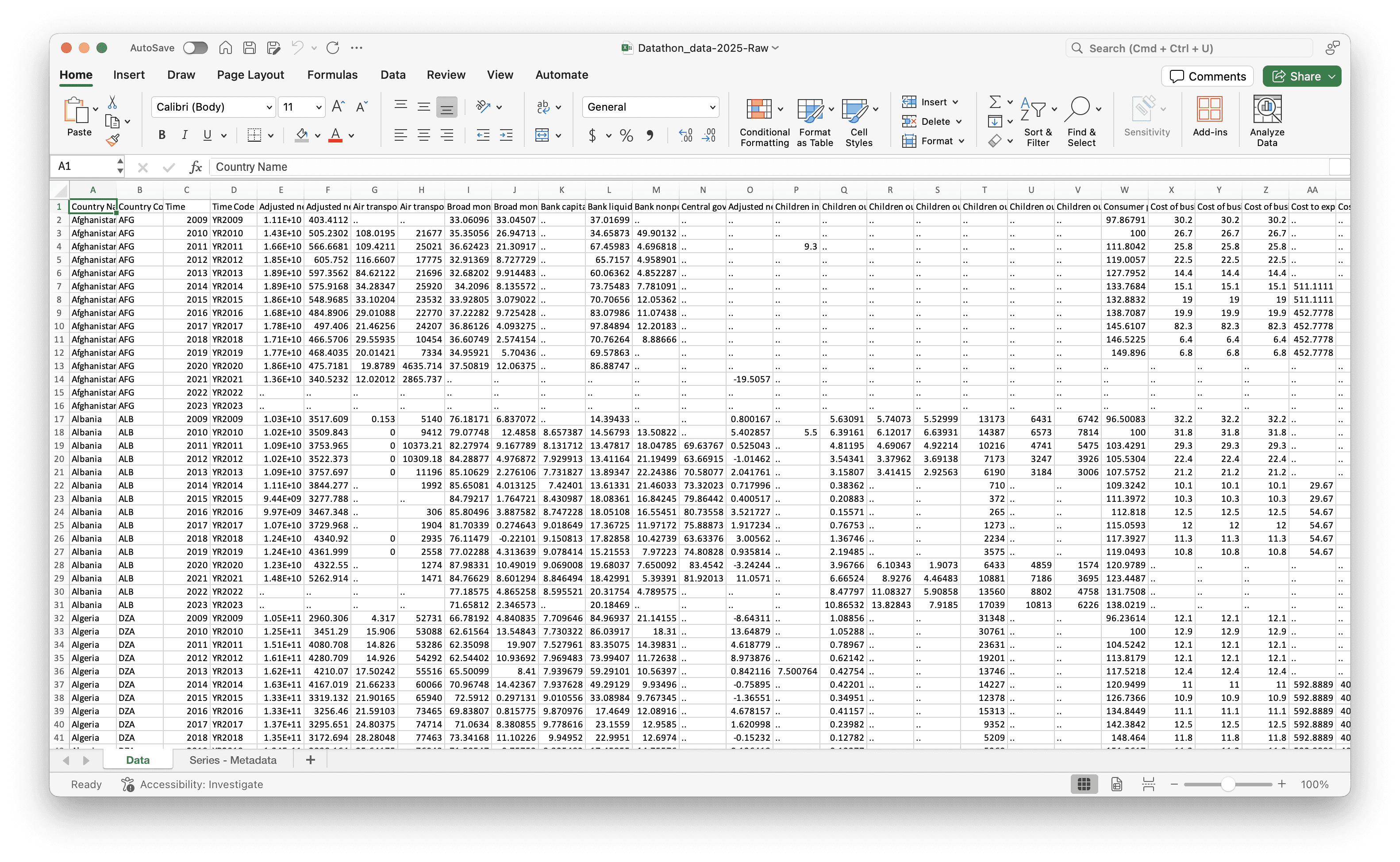
The in-use dataframe is as follows

Exploratory Data Analysis (EDA)
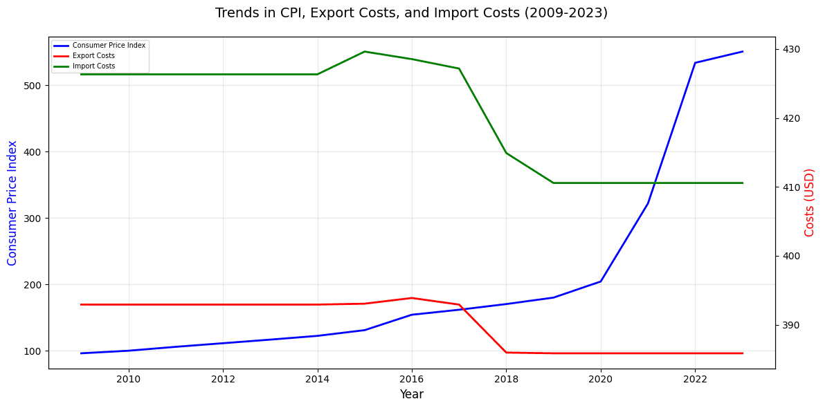
# Time Series Analysis
# Cost analysis
def plot_metrics_over_time(df):
    # Reset index to get country and year as columns
    df_reset = df.reset_index()
    df_reset.columns = ['Country', 'Year'] + list(df_reset.columns[2:])

    # Calculate mean values for each year
    yearly_means = df_reset.groupby('Year').agg({
        'Consumer price index': 'mean',
        'Cost to export, border compliance': 'mean',
        'Cost to import, border compliance': 'mean'
    }).reset_index()

    # Create the plot
    plt.figure(figsize=(12, 6))

    # Create multiple y-axes for different scales
    ax1 = plt.gca()
    ax2 = ax1.twinx()

    # Plot each metric
    line1 = ax1.plot(yearly_means['Year'],
                     yearly_means['Consumer price index'],
                     'b-',
                     label='Consumer Price Index',
                     linewidth=2)

    line2 = ax2.plot(yearly_means['Year'],
                     yearly_means['Cost to export, border compliance'],
                     'r-',
                     label='Export Costs',
                     linewidth=2)

    line3 = ax2.plot(yearly_means['Year'],
                     yearly_means['Cost to import, border compliance'],
                     'g-',
                     label='Import Costs',
                     linewidth=2)

    # Customize the plot
    ax1.set_xlabel('Year', fontsize=12)
    ax1.set_ylabel('Consumer Price Index', color='b', fontsize=12)
    ax2.set_ylabel('Costs (USD)', color='r', fontsize=12)

    # Combine legends from both axes
    lines = line1 + line2 + line3
    labels = [l.get_label() for l in lines]
    ax1.legend(lines, labels, loc='upper left', fontsize = 'x-small')

    # Add title
    plt.title('Trends in CPI, Export Costs, and Import Costs (2009-2023)',
             fontsize=14,
             pad=20)

    # Add grid for better readability
    ax1.grid(True, alpha=0.3)

    # Rotate x-axis labels for better readability
    plt.xticks(rotation=45)

    # Adjust layout to prevent label cutoff
    plt.tight_layout()

    # Show the plot
    plt.show()

    # Print some summary statistics
    print("\nSummary Statistics:")
    print("\nAverage values by year:")
    print(yearly_means.round(2).to_string(index=False))

    # Calculate overall change
    first_year = yearly_means.iloc[0]
    last_year = yearly_means.iloc[-1]

    print("\nOverall Changes (2009-2023):")
    print(f"CPI Change: {((last_year['Consumer price index'] / first_year['Consumer price index']) - 1) * 100:.1f}%")
    print(f"Export Costs Change: {((last_year['Cost to export, border compliance'] / first_year['Cost to export, border compliance']) - 1) * 100:.1f}%")
    print(f"Import Costs Change: {((last_year['Cost to import, border compliance'] / first_year['Cost to import, border compliance']) - 1) * 100:.1f}%")

# Execute function
plot_metrics_over_time(df)
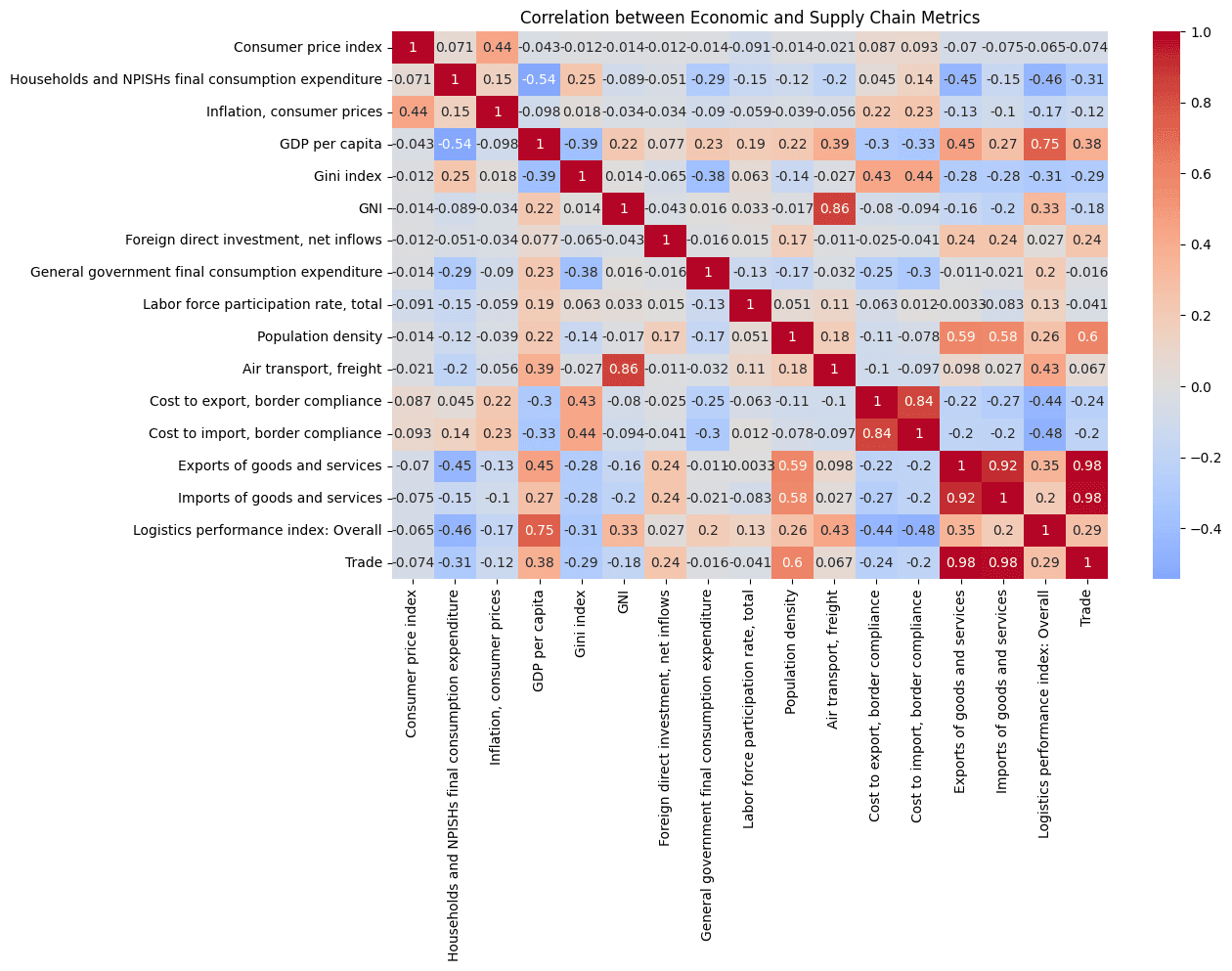
# Correlation Matrix
# Correlation matrix
def analyze_correlation_economic(df):

    # Reset index to make country and year accessible columns
    df_reset = df.reset_index()
    df_reset.columns = ['Country Name', 'Year'] + list(df_reset.columns[2:])

    # Create relevant metric correlations
    economic_supply_metrics = [
        'Consumer price index',
        'Households and NPISHs final consumption expenditure',
        'Inflation, consumer prices',
        'GDP per capita',
        'Gini index',
        'GNI',
        'Foreign direct investment, net inflows',
        'General government final consumption expenditure',
        'Labor force participation rate, total',
        'Population density',
        'Air transport, freight',
        'Cost to export, border compliance',
        'Cost to import, border compliance',
        'Exports of goods and services',
        'Imports of goods and services',
        'Logistics performance index: Overall',
        'Trade'
    ]

    # Calculate correlation matrix
    correlation_matrix = df_reset[economic_supply_metrics].corr()

    # Visualizations
    plt.figure(figsize=(26, 16))

    # Correlation Heatmap
    plt.subplot(2, 2, 1)
    sns.heatmap(correlation_matrix, annot=True, cmap='coolwarm', center=0)
    plt.title('Correlation between Economic and Supply Chain Metrics')

# Execute function
analyze_correlation_economic(df)
# Correlation analysis for LPI
def analyze_logistics_relationships(df):
    # Reset index to get country and year as columns
    df_reset = df.reset_index()
    df_reset.columns = ['Country Name', 'Year'] + list(df_reset.columns[2:])

    # Create subplots
    fig, axes = plt.subplots(3, 2, figsize=(15, 12))
    fig.suptitle('Key Relationships with Logistics Performance Index', fontsize=16, y=1.02)

    # Plot 1: LPI vs Air Transport
    sns.scatterplot(data=df_reset,
                   x='Logistics performance index: Overall',
                   y='Air transport, freight',
                   ax=axes[0,0])
    axes[0,0].set_title('LPI vs Air Transport\nCorrelation: 0.43')

    # Plot 2: LPI vs Export Costs
    sns.scatterplot(data=df_reset,
                   x='Logistics performance index: Overall',
                   y='Cost to export, border compliance',
                   ax=axes[0,1])
    axes[0,1].set_title('LPI vs Export Costs\nCorrelation: -0.44')

    # Plot 3: LPI vs Import Costs
    sns.scatterplot(data=df_reset,
                   x='Logistics performance index: Overall',
                   y='Cost to import, border compliance',
                   ax=axes[1,0])
    axes[1,0].set_title('LPI vs Import Costs\nCorrelation: -0.48')

    # Plot 4: LPI vs Trade
    sns.scatterplot(data=df_reset,
                   x='Logistics performance index: Overall',
                   y='Trade',
                   ax=axes[1,1])
    axes[1,1].set_title('LPI vs Trade\nCorrelation: 0.29')

    # Plot 5: LPI vs GDP per capita
    sns.scatterplot(data=df_reset,
                   x='Logistics performance index: Overall',
                   y='GDP per capita',
                   ax=axes[2,0])
    axes[2,0].set_title('LPI vs GDP per capita\nCorrelation: 0.75')

    # Plot 6: LPI vs Households Consumption Expenditure
    sns.scatterplot(data=df_reset,
                   x='Logistics performance index: Overall',
                   y='Households and NPISHs final consumption expenditure',
                   ax=axes[2,1])
    axes[2,1].set_title('LPI vs Household spending\nCorrelation: -0.46')

    # Adjust layout
    plt.tight_layout()

    # Add trend lines to each plot
    for ax in axes.flat:
        x = df_reset[ax.get_xlabel()]
        y = df_reset[ax.get_ylabel()]
        z = np.polyfit(x, y, 1)
        p = np.poly1d(z)
        ax.plot(x, p(x), "r--", alpha=0.8)

    plt.show()

    # Calculate additional statistics
    print("\nDetailed Statistics for Each Relationship:")

    relationships = [
        ('Air transport, freight', 0.43),
        ('Cost to export, border compliance', -0.44),
        ('Cost to import, border compliance', -0.48),
        ('Trade', 0.29),
        ('GDP per capita', 0.75),
        ('Households and NPISHs final consumption expenditure', -0.46)
    ]

    for var, corr in relationships:
        data = df_reset[[var, 'Logistics performance index: Overall']].dropna()
        slope, intercept, r_value, p_value, std_err = stats.linregress(
            data['Logistics performance index: Overall'],
            data[var]
        )

        print(f"\n{var}:")
        print(f"Correlation: {corr:.3f}")
        print(f"R-squared: {r_value**2:.3f}")
        print(f"P-value: {p_value:.3e}")

# Run the analysis
analyze_logistics_relationships(df)

# Segmentation
def gdp_segmentation(df):
    # Reset index to get country and year as columns
    df_reset = df.reset_index()
    df_reset.columns = ['Country Name', 'Year'] + list(df_reset.columns[2:])

    # Segment countries by GDP per capita
    df_reset['GDP_Category'] = pd.qcut(df_reset['GDP per capita'],
                                     q=3,
                                     labels=['Low GDP', 'Medium GDP', 'High GDP'])

    # Analysis by GDP segment
    gdp_segments = []

    for gdp_cat in df_reset['GDP_Category'].unique():
        segment_data = df_reset[df_reset['GDP_Category'] == gdp_cat]

        # Calculate correlations for this segment
        # Handle potential missing values
        mask = ~(pd.isna(segment_data['Consumer price index']) | pd.isna(segment_data['Trade']))
        if mask.sum() > 1:  # Need at least 2 points for correlation
            corr = np.corrcoef(
                segment_data.loc[mask, 'Consumer price index'],
                segment_data.loc[mask, 'Trade']
            )[0,1]
        else:
            corr = np.nan

        # Calculate mean values with handling for missing values
        mean_values = {
            'Mean_CPI': segment_data['Consumer price index'].mean(),
            'Mean_FDI': segment_data['Foreign direct investment, net inflows'].mean(),
            'Mean_Air_Transport': segment_data['Air transport, freight'].mean(),
            'Mean_Export_Cost': segment_data['Cost to export, border compliance'].mean(),
            'Mean_Import_Cost': segment_data['Cost to import, border compliance'].mean(),
            'Mean_Export': segment_data['Exports of goods and services'].mean(),
            'Mean_Import': segment_data['Imports of goods and services'].mean(),
            'Mean_LPI': segment_data['Logistics performance index: Overall'].mean(),
            'Mean_Trade': segment_data['Trade'].mean()
        }

        gdp_segments.append({
            'GDP_Category': gdp_cat,
            'CPI_Trade_Correlation': corr,
            **mean_values  # Include all mean values
        })

    return {'gdp_segments': gdp_segments}

def print_insights(results):
    print("\nInsights by GDP Category:")
    for segment in results['gdp_segments']:
        print(f"\n{segment['GDP_Category']}:")
        print(f"CPI-Trade Correlation: {segment['CPI_Trade_Correlation']:.3f}")
        print(f"Average CPI: {segment['Mean_CPI']:.2f}")
        print(f"Average FDI: {segment['Mean_FDI']:,.2f}% of GDP")
        print(f"Average Air Transport: {segment['Mean_Air_Transport']:,.2f} million ton-km")
        print(f"Average Export Cost: ${segment['Mean_Export_Cost']:.2f}")
        print(f"Average Import Cost: ${segment['Mean_Import_Cost']:.2f}")
        print(f"Average Exports: {segment['Mean_Export']:,.2f}% of GDP")
        print(f"Average Imports: {segment['Mean_Import']:,.2f}% of GDP")
        print(f"Average Logistics Performance Index: {segment['Mean_LPI']:.2f}")
        print(f"Average Trade: {segment['Mean_Trade']:,.2f}% of GDP")

# Execute function
results = gdp_segmentation(df)
print_insights(results)
# Volatility analysis
def volatility_analysis(df):
    # Reset index to get country and year as columns
    df_reset = df.reset_index()
    df_reset.columns = ['Country Name', 'Year'] + list(df_reset.columns[2:])

    df_reset['CPI_Volatility'] = df_reset.groupby('Country Name')['Consumer price index'].transform(lambda x: x.std())
    df_reset['Household_Expenditure_Volatility'] = df_reset.groupby('Country Name')['Households and NPISHs Final consumption expenditure, PPP'].transform(lambda x: x.std())

    # Find countries with highest volatility
    top_cpi = df_reset.groupby('Country Name').agg({
        'CPI_Volatility': 'first',
        'Household_Expenditure_Volatility': 'first'
    }).sort_values('CPI_Volatility', ascending=False).head(5)

    top_expenditure = df_reset.groupby('Country Name').agg({
        'CPI_Volatility': 'first',
        'Household_Expenditure_Volatility': 'first'
    }).sort_values('Household_Expenditure_Volatility', ascending=False).head(5)

    # Get the list of volatile countries
    volatile_cpi_countries = top_cpi.index.tolist()
    volatile_exp_countries = top_expenditure.index.tolist()

    # Filter data for volatile countries
    cpi_volatile_data = df_reset[df_reset['Country Name'].isin(volatile_cpi_countries)]
    exp_volatile_data = df_reset[df_reset['Country Name'].isin(volatile_exp_countries)]

    # Create visualizations
    sns.set_style("whitegrid")

    # 1. Air Freight Trends
    fig, (ax1, ax2) = plt.subplots(2, 1, figsize=(15, 12))

    # Plot for CPI volatile countries
    for country in volatile_cpi_countries:
        country_data = cpi_volatile_data[cpi_volatile_data['Country Name'] == country]
        ax1.plot(country_data['Year'], country_data['Air transport, freight'],
                marker='o', label=country)

    ax1.set_title('Air Freight Trends - Countries with High CPI Volatility')
    ax1.set_xlabel('Year')
    ax1.set_ylabel('Air Transport Freight')
    ax1.legend(bbox_to_anchor=(1.05, 1), loc='upper left')
    ax1.grid(True)

    # Plot for Expenditure volatile countries
    for country in volatile_exp_countries:
        country_data = exp_volatile_data[exp_volatile_data['Country Name'] == country]
        ax2.plot(country_data['Year'], country_data['Air transport, freight'],
                marker='o', label=country)

    ax2.set_title('Air Freight Trends - Countries with High Expenditure Volatility')
    ax2.set_xlabel('Year')
    ax2.set_ylabel('Air Transport Freight')
    ax2.legend(bbox_to_anchor=(1.05, 1), loc='upper left')
    ax2.grid(True)

    plt.tight_layout()
    plt.show()

    # 2. Trade Trends
    fig, (ax1, ax2) = plt.subplots(2, 1, figsize=(15, 12))

    # Plot for CPI volatile countries
    for country in volatile_cpi_countries:
        country_data = cpi_volatile_data[cpi_volatile_data['Country Name'] == country]
        ax1.plot(country_data['Year'], country_data['Trade'],
                marker='o', label=country)

    ax1.set_title('Trade Trends - Countries with High CPI Volatility')
    ax1.set_xlabel('Year')
    ax1.set_ylabel('Trade (% of GDP)')
    ax1.legend(bbox_to_anchor=(1.05, 1), loc='upper left')
    ax1.grid(True)

    # Plot for Expenditure volatile countries
    for country in volatile_exp_countries:
        country_data = exp_volatile_data[exp_volatile_data['Country Name'] == country]
        ax2.plot(country_data['Year'], country_data['Trade'],
                marker='o', label=country)

    ax2.set_title('Trade Trends - Countries with High Expenditure Volatility')
    ax2.set_xlabel('Year')
    ax2.set_ylabel('Trade (% of GDP)')
    ax2.legend(bbox_to_anchor=(1.05, 1), loc='upper left')
    ax2.grid(True)

    plt.tight_layout()
    plt.show()

    # Print volatility rankings
    print("\nTop 5 Countries with Highest CPI Volatility:")
    print(top_cpi)

    print("\nTop 5 Countries with Highest Household Expenditure Volatility:")
    print(top_expenditure)

    # Calculate summary statistics for volatile countries
    print("\nSummary Statistics for Volatile Countries:")

    print("\nCPI Volatile Countries - Average Trade and Air Freight:")
    print(cpi_volatile_data.groupby('Country Name').agg({
        'Trade': 'mean',
        'Air transport, freight': 'mean'
    }).round(2))

    print("\nExpenditure Volatile Countries - Average Trade and Air Freight:")
    print(exp_volatile_data.groupby('Country Name').agg({
        'Trade': 'mean',
        'Air transport, freight': 'mean'
    }).round(2))

    return df_reset

volatile_data = volatility_analysis(df)


def regional_patterns(df):
    # Reset index to get country and year as columns
    df_reset = df.reset_index()
    df_reset.columns = ['Country Name', 'Year'] + list(df_reset.columns[2:])

    # Define regions and their countries
    region_mapping = {
        'Europe & Central Asia': ['Luxembourg', 'Norway', 'Switzerland', 'Ireland', 'Turkiye', 'Russian Federation'],
        'Middle East & North Africa': ['Qatar', 'Syrian Arab Republic', 'United Arab Emirates', 'Iraq'],
        'Sub-Saharan Africa': ['Congo, Dem. Rep.', 'Madagascar', 'Liberia', 'Guinea-Bissau', 'Sudan', 'Angola'],
        'South Asia': ['Afghanistan', 'India'],
        'East Asia & Pacific': ['China', 'Vietnam', 'Australia', 'Indonesia'],
        'North America': ['United States', 'Canada'],
        'Latin America & Caribbean': ['Venezuela, RB', 'Chile', 'Costa Rica']
    }

    # Create reverse mapping from country to region
    country_to_region = {country: region for region, countries in region_mapping.items()
                        for country in countries}

    # Filter for only specified countries and assign regions
    df_reset = df_reset[df_reset['Country Name'].isin(country_to_region.keys())]
    df_reset['Region'] = df_reset['Country Name'].map(country_to_region)

    # Calculate regional patterns
    regional_patterns = df_reset.groupby('Region').agg({
        'Consumer price index': 'mean',
        'GDP per capita': 'mean',
        'Gini index': 'mean',
        'GNI per capita, PPP': 'mean',
        'Foreign direct investment, net inflows': 'mean',
        'General government final consumption expenditure': 'mean',
        'Employment to population ratio, 15+, total': 'mean',
        'Poverty headcount ratio at national poverty lines': 'mean',
        'Air transport, freight': 'mean',
        'Cost to export, border compliance': 'mean',
        'Cost to import, border compliance': 'mean',
        'Logistics performance index: Overall': 'mean',
        'Trade': 'mean'
    }).round(2)

    # Create visualizations
    create_regional_visualizations(df_reset)

    return regional_patterns

def create_regional_visualizations(df):
    sns.set_style("whitegrid")

    # 1.1 GDP per capita by Region (Box Plot)
    plt.figure(figsize=(12, 6))
    sns.boxplot(x='Region', y='GDP per capita', data=df)
    plt.xticks(rotation=45, ha='right')
    plt.title('GDP per Capita Distribution by Region')
    plt.tight_layout()
    plt.show()

    # 1.2 Household spending by Region (Box Plot)
    plt.figure(figsize=(12, 6))
    sns.boxplot(x='Region', y='Households and NPISHs Final consumption expenditure, PPP', data=df)
    plt.xticks(rotation=45, ha='right')
    plt.title('Consumption Expenditure Distribution by Region')
    plt.tight_layout()
    plt.show()

    # 2. Development Indicators Heatmap
    indicators = ['GDP per capita', 'Gini index', 'Trade',
                 'Employment to population ratio, 15+, total',
                 'Logistics performance index: Overall']

    pivot_data = df.pivot_table(
        index='Region',
        values=indicators,
        aggfunc='mean'
    )

    # Normalize the data for better visualization
    normalized_data = (pivot_data - pivot_data.mean()) / pivot_data.std()

    plt.figure(figsize=(12, 8))
    sns.heatmap(normalized_data, annot=True, cmap='RdYlBu', center=0, fmt='.2f')
    plt.title('Regional Development Indicators (Normalized Values)')
    plt.tight_layout()
    plt.show()

    # 3. Trade and Economic Performance
    plt.figure(figsize=(12, 6))
    sns.scatterplot(data=df, x='Trade', y='GDP per capita', hue='Region',
                   alpha=0.6, size='Logistics performance index: Overall',
                   sizes=(50, 400))
    plt.title('Trade vs GDP per Capita by Region')
    plt.xlabel('Trade')
    plt.ylabel('GDP per Capita')
    plt.legend(bbox_to_anchor=(1.05, 1), loc='upper left')
    plt.tight_layout()
    plt.show()

def print_regional_insights(regional_patterns):
    print("\nRegional Economic Insights:")

    # Create a summary table with key metrics
    summary_table = pd.DataFrame({
        'GDP per capita': regional_patterns['GDP per capita'].map('${:,.0f}'.format),
        'Trade (% of GDP)': regional_patterns['Trade'].map('{:.1f}%'.format),
        'Employment Ratio (%)': regional_patterns['Employment to population ratio, 15+, total'].map('{:.1f}%'.format),
        'Logistics Score': regional_patterns['Logistics performance index: Overall'].map('{:.2f}'.format),
        'Gini Index': regional_patterns['Gini index'].map('{:.1f}'.format)
    })

    print("\nRegional Economic Summary:")
    print(tabulate(summary_table, headers='keys', tablefmt='pretty'))

    # Detailed insights by region
    print("\nDetailed Regional Insights:")
    for region in regional_patterns.index:
        print(f"\n{region}:")
        print(f"GDP per capita: ${regional_patterns.loc[region, 'GDP per capita']:,.2f}")
        print(f"Gini Index: {regional_patterns.loc[region, 'Gini index']:.1f}")
        print(f"GNI per capita (PPP): ${regional_patterns.loc[region, 'GNI per capita, PPP']:,.2f}")
        print(f"FDI (% of GDP): {regional_patterns.loc[region, 'Foreign direct investment, net inflows']:.1f}%")
        print(f"Consumption expenditure: ${regional_patterns.loc[region, 'General government final consumption expenditure']:,.2f}")
        print(f"Employment ratio: {regional_patterns.loc[region, 'Employment to population ratio, 15+, total']:.1f}%")
        print(f"Poverty headcount ratio: {regional_patterns.loc[region, 'Poverty headcount ratio at national poverty lines']:.1f}%")
        print(f"Air transport: {regional_patterns.loc[region, 'Air transport, freight']:,.2f} million ton-km")
        print(f"Trade (% of GDP): {regional_patterns.loc[region, 'Trade']:.1f}%")
        print(f"Logistics performance: {regional_patterns.loc[region, 'Logistics performance index: Overall']:.2f}")

patterns = regional_patterns(df)
print_regional_insights(patterns)
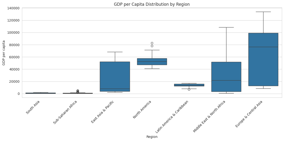

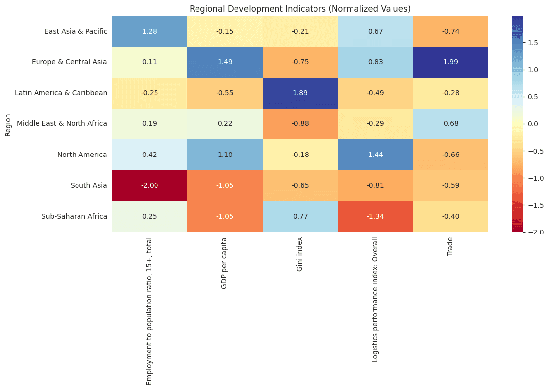

Feature Engineering
def calculate_wa_cost(df):
    """
    Calculate weighted average for cost of living:
    1. CPI changes
    2. Household consumption expenditure

    Calculate weighted average for cost to trade:
    1. Cost to export
    2. Cost to import
    """
    # Reset index
    df_reset = df.reset_index()
    df_reset.columns = ['Country Name', 'Year'] + list(df_reset.columns[2:])

    # Calculate year-over-year changes for each component
    df_reset['CPI_Change'] = df_reset.groupby('Country Name')['Consumer price index'].pct_change() * 100
    df_reset['Consumption_Change'] = df_reset.groupby('Country Name')['Households and NPISHs final consumption expenditure'].pct_change() * 100
    df_reset['WA_CoL'] = (
        0.5 * df_reset['CPI_Change'] +  # Base CPI change
        0.5 * df_reset['Consumption_Change']  # Consumption patterns
    )

    # Calculate supply chain impact metrics (in percentage)
    df_reset['Export_Cost_Change'] = df_reset.groupby('Country Name')['Cost to export, border compliance'].pct_change() * 100
    df_reset['Import_Cost_Change'] = df_reset.groupby('Country Name')['Cost to import, border compliance'].pct_change() * 100
    df_reset['WA_CoT'] = (
        0.5 * df_reset['Export_Cost_Change'] +  # Export costs
        0.5 * df_reset['Import_Cost_Change']  # Import costs
    )

    # Create visualizations
    fig, axes = plt.subplots(2, 1, figsize=(15, 12))

    # Plot 1: Cost of Living Components Over Time
    yearly_components = df_reset.groupby('Year').agg({
        'CPI_Change': 'mean',
        'Consumption_Change': 'mean',
        'Inflation, consumer prices': 'mean',
        'WA_CoL': 'mean'
    })

    axes[0].plot(yearly_components.index, yearly_components['WA_CoL'], 'b-', label='Cost of Living', linewidth=3)
    axes[0].plot(yearly_components.index, yearly_components['CPI_Change'], 'r--', label='CPI Change', linewidth=2)
    axes[0].plot(yearly_components.index, yearly_components['Consumption_Change'], 'g--', label='Consumption Change', linewidth=2)
    axes[0].plot(yearly_components.index, yearly_components['Inflation, consumer prices'], 'y--', label='Inflation', linewidth=2)
    axes[0].set_title('Cost of Living and Its Components Over Time')
    axes[0].legend()
    axes[0].grid(True)
    axes[0].set_ylabel('Percentage Change (%)')

    # Plot 2: Cost of Living vs Supply Chain Costs
    yearly_metrics = df_reset.groupby('Year').agg({
        'WA_CoL': 'mean',
        'Export_Cost_Change': 'mean',
        'Import_Cost_Change': 'mean',
        'WA_CoT': 'mean'
    })

    axes[1].plot(yearly_metrics.index, yearly_metrics['WA_CoL'], 'b-', label='Cost of Living', linewidth=3)
    axes[1].plot(yearly_metrics.index, yearly_metrics['WA_CoT'], 'r-', label='Cost of Trade', linewidth=3)
    axes[1].plot(yearly_metrics.index, yearly_metrics['Export_Cost_Change'], 'r--', label='Export Cost Change', linewidth=2)
    axes[1].plot(yearly_metrics.index, yearly_metrics['Import_Cost_Change'], 'g--', label='Import Cost Change', linewidth=2)
    axes[1].set_title('Cost of Living vs Supply Chain Cost Changes')
    axes[1].legend()
    axes[1].grid(True)
    axes[1].set_ylabel('Percentage Change (%)')

    plt.tight_layout()
    plt.show()

    # Calculate correlations
    cost_correlations = df_reset[[
        'WA_CoL',
        'Air transport, freight',
        'Export_Cost_Change',
        'Import_Cost_Change',
        'Logistics performance index: Overall',
        'Trade',
        'WA_CoT'
    ]].corr()[['WA_CoL', 'WA_CoT']]

    # Group analysis by Cost of Living quartiles
    df_reset['CoL_Quartile'] = pd.qcut(df_reset['WA_CoL'].fillna(0), q=4, labels=['Low', 'Medium-Low', 'Medium-High', 'High'])

    quartile_analysis = df_reset.groupby('CoL_Quartile').agg({
        'Air transport, freight': 'mean',
        'Cost to export, border compliance': 'mean',
        'Cost to import, border compliance': 'mean',
        'Logistics performance index: Overall': 'mean',
        'WA_CoL': ['mean', 'count'],  # Include count to see sample size
        'WA_CoT': 'mean'
    }).round(2)

    print("\nCorrelations with Cost Measures:")
    print(cost_correlations.round(3))

    print("\nSupply Chain Metrics by Cost of Living Quartile:")
    print(quartile_analysis)

    # Additional statistics
    print("\nAverage Cost Measures by Year:")
    print(yearly_metrics[['WA_CoL', 'WA_CoT']].round(2))

    return df_reset

df_with_costs = calculate_wa_cost(df)
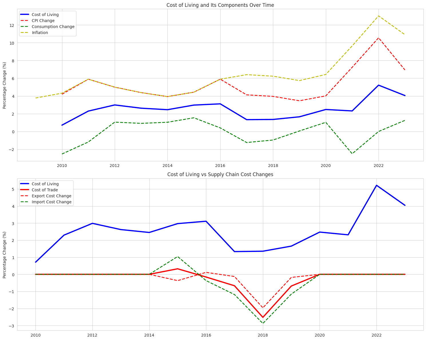
Regression Model
def predict_trade_ability(df):
    """
    Create panel data model to predict trade ability (Trade % of GDP)
    """
    # Reset index and prepare panel data
    df_reset = df.reset_index()
    df_reset.columns = ['Country', 'Year'] + list(df_reset.columns[2:])

    # Prepare panel data
    df_panel = df_reset.set_index(['Country', 'Year'])

    # Dependent variable: Trade (% of GDP)
    Y = df_panel['Trade']

    # Independent variables selected for trade prediction
    X = df_panel[[
        'GDP per capita',  # Economic development
        'Air transport, freight',  # Transportation capacity
        'Cost to export, border compliance',  # Trade barriers
        'Cost to import, border compliance',  # Trade barriers
        'Logistics performance index: Overall',  # Infrastructure quality
        'Foreign direct investment, net inflows',  # International investment
        'Employment to population ratio, 15+, total',  # Labor market
        'Consumer price index'  # Domestic prices
    ]]

    # Handle missing values
    X = X.fillna(X.mean())
    Y = Y.fillna(Y.mean())

    # Fixed Effects Model
    model_fe = PanelOLS(Y, X, entity_effects=True)
    fe_results = model_fe.fit()

    # Random Effects Model
    model_re = PanelOLS(Y, X, entity_effects=False)
    re_results = model_re.fit()

    # Hausman Test
    def hausman(fe_res, re_res):
        b_diff = fe_res.params - re_res.params
        cov_diff = fe_res.cov - re_res.cov
        stat = np.dot(b_diff.T, np.linalg.solve(cov_diff, b_diff))
        p_value = 1 - stats.chi2.cdf(stat, len(b_diff))
        return stat, p_value

    hausman_stat, hausman_p_value = hausman(fe_results, re_results)

    # Print results
    print("\nFixed Effects Model Results:")
    print(fe_results)

    print("\nRandom Effects Model Results:")
    print(re_results)

    print(f"\nHausman Test Statistic: {hausman_stat:.2f}, P-value: {hausman_p_value:.4f}")

    # Choose model based on Hausman test
    chosen_model = fe_results if hausman_p_value < 0.05 else re_results

    # Add predictions to the panel data
    df_panel['Predicted_Trade'] = chosen_model.fitted_values

    # Visualizations
    # 1. Actual vs Predicted
    plt.figure(figsize=(12, 6))
    plt.scatter(df_panel['Trade'], df_panel['Predicted_Trade'], alpha=0.5)
    plt.plot([df_panel['Trade'].min(), df_panel['Trade'].max()],
             [df_panel['Trade'].min(), df_panel['Trade'].max()],
             'r--', lw=2)
    plt.xlabel('Actual Trade (% of GDP)')
    plt.ylabel('Predicted Trade (% of GDP)')
    plt.title('Actual vs Predicted Trade Openness')
    plt.grid(True)
    plt.show()

    # 2. Feature Importance
    plt.figure(figsize=(12, 6))
    coefficients = pd.Series(chosen_model.params)
    coefficients = coefficients.sort_values(ascending=True)
    coefficients.plot(kind='bar')
    plt.title('Feature Importance in Trade Prediction')
    plt.xlabel('Features')
    plt.ylabel('Coefficient Value')
    plt.xticks(rotation=45, ha='right')
    plt.tight_layout()
    plt.show()

    # 3. Trade by Logistics Performance
    plt.figure(figsize=(10, 6))
    df_panel['LPI_Quartile'] = pd.qcut(df_panel['Logistics performance index: Overall'],
                                      4, labels=['Low', 'Medium-Low', 'Medium-High', 'High'])
    sns.boxplot(x='LPI_Quartile', y='Trade', data=df_panel.reset_index())
    plt.title('Trade Distribution by Logistics Performance')
    plt.xlabel('Logistics Performance Index Quartile')
    plt.ylabel('Trade (% of GDP)')
    plt.xticks(rotation=45)
    plt.tight_layout()
    plt.show()

    return df_panel, chosen_model

panel_data, model = predict_trade_ability(df)
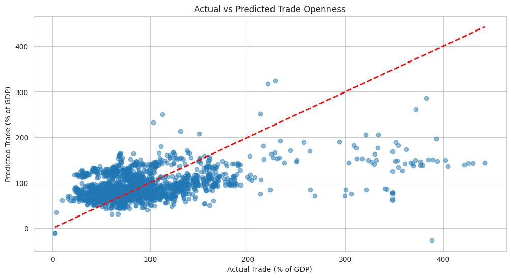

Other Projects


© 2026. All rights Reserved.
© 2026. All rights Reserved.